Trello Search
A Design Exploration to improve search functionality for a project management tool

Trello is a project management app focused on flexible management of tasks, called “cards”, and I had a growing suspicion that its search function made it difficult for users to find the cards they were looking for quickly. I recently asked a coworker if she wanted the link to a Trello card we were discussing and she said, “Omg amazing!!! thank you!! that saved me about 20 mins”. Her response resonated with my own struggles with finding cards in Trello, and if this was an issue for frequent Trello users like us, how many more people were struggling with this? How much time was collectively being spent looking for cards in Trello? There had to be a better way!
An accurate and intuitive search is imperative for a project management app to promote user retention and increase customer lifetime value, and Trello’s search experience was hurting their business.
I took on a design exploration to uncover Trello's pain points and design a more efficient search experience. I led every step of the design thinking process, from research to design and ultimately to testing.
I held 30-minute one-on-one video interviews with 7 users who frequently use Trello and asked them about their habits and their opinions of the app. I then created an affinity map to organize the data from the interviews. I also ran a competitive analysis on 3 direct competitors and identified that all offer a search bar, automatic search suggestions, and the ability to filter by specific fields.


-min%202.png)
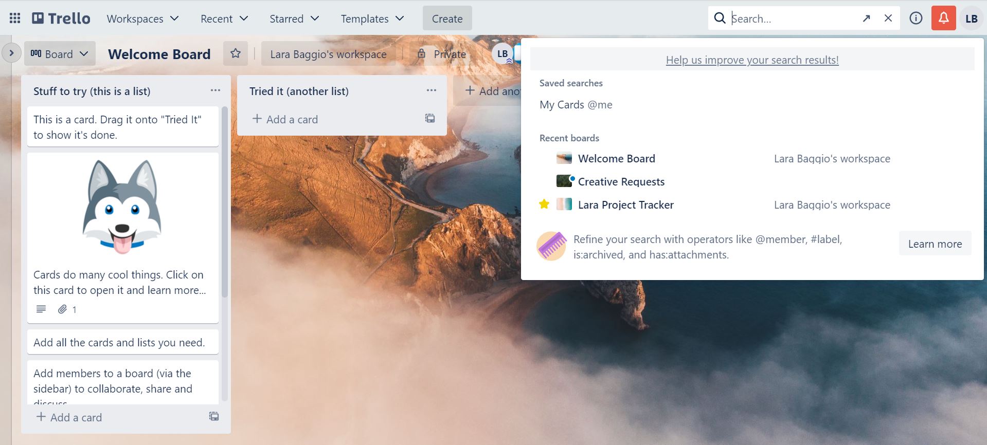
When it comes to initiating search, users didn’t have issues accessing the search bar or inserting keywords so I didn’t see a need to alter the current experience. To improve usability of the search drop-down menu, I surfaced cards users recently interacted with instead of showing Trello boards when clicking on the search bar prior to typing keywords. I also added key information to the cards' preview to easily scan for desired content.
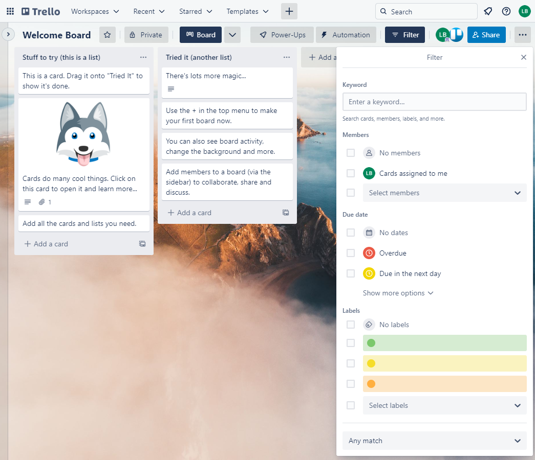
To filter down search results, I designed a horizontal filters menu at the top of the search results drop-down menu that listed the filter categories in decreasing priority from left to right. I chose horizontal filters because I deemed it the cleanest design for few filter categories. I located it at the top of the search results so users could access all the filters after starting a search. I placed Label and Due Date first as they were the most important filters that users noted in interviews.
I then added a drop-down menu for each filter in the filter menu so users could select the filters to narrow down the search results. To confirm the filter selections in the drop-down menus, I chose a “select and click away from the menu” approach as it seemed the simplest and most common option. I still had concerns about the clarity of this approach though, so I made a note to focus on it during user testing.
For the Label filter drop-down menu, I set up two sections, Color and All Labels, to reflect the types of labels users could create. To keep findability easy for users with many labels, I ordered the All Labels list alphabetically and added a search bar at the top of the drop-down to find labels through keywords.
For the Due date filter drop-down menu, I leveraged Trello’s calendar function. The user could select the date(s) from the drop-down calendar and the selected date(s) would then auto-populate in the field of the drop-down menu to confirm the selection.
To confirm and review the applied filters, I listed the applied filters between the filter menu and the search results. I saw the opportunity to add a similar experience for applied keywords but given the difference in interaction between keywords and filters, I wanted to separate how they were listed. I updated the header above the search results following a keyword search from “Cards” to “Cards with keyword [insert keyword]” to note this difference.
I prepared for the user test by creating a testing brief and a use-case scenario. My goal was to evaluate whether the updated design enabled users to find the cards they were looking for quickly and intuitively. I refined the sketches to build a low-fidelity prototype on PowerPoint and had 4 users interact with the prototype virtually.


Trello already used a fun animation to load content, so I used that same animation to update the cards behind the filter drop-down menu to show users that their selection impacted the search results. Since that animation would already be associated with content loading and updating, it would work as the visual cue I needed to confirm to users their filter selection worked as intended while keeping consistent cues across the full experience.
I was thinking of labels as color and color + name when the only difference for users was color and name. I updated the drop-down menu to note these sections instead. It was now clear that the search bar only applied to labels by name so I moved it under that section and update its copy to clarify that it was there to find labels by name, not to filter actual search results.
The simple solution was to list applied filters and keywords the same way. When I tried adding keywords to the vertical list of applied filters in the current design, the search results got pushed below the fold. I changed to a horizontal display as it provided more space to show applied filters and keywords without pushing the search results down.
Now that the filters were listed next to each other horizontally, I needed a way to visually separate the applied filters if multiple were selected. I decided to put each filter inside its own button. I also added an “x” on the top right corner of each button upon hover, on desktop, or tap, on mobile, that, if selected, would remove that applied filter or keyword.
To help scan content quickly, I also wanted to incorporate the highlight of searched keywords on the search results as I had seen on search engines. I added a faint highlight on the search result cards for any word that matched the inputted keyword to create a quick association between what was searched and that keyword’s location in the search results.


Search Menu
Search Menu
Search Results
Search Results
Label Filters
Label Filters
Due Date Filters
Due Date Filters
In this round of usability testing, I wanted to evaluate whether users could find cards quickly, intuitively, and without the friction caused from the previously-flagged issues. I created a simple scenario to ask users based on use-cases I heard in user interviews. I also focused on the changes made since the previous round of user testing to evaluate whether the solutions proved successful. I met with 5 users who interacted with the prototype virtually.
Given the opportunities for improvement that arose from the medium-fidelity users testing, I would want to revise the areas that causes user confusion and re-test to ensure the updates addressed the issues as intended. After I feel confident that the updates made are positively impacting the search experience and not causing additional confusion, then I can move into creating a high-fidelity product.
I also see an opportunity to think about how the changes can be applied to the rest of the experience, and not just for in the search process, to ensure a cohesive user journey from start to finish. For example, how can these updates be reflected in the filters menu that lives outside of the search menu? Is that section still necessary given the improvements made to search? Are there any other areas that these updates now impact and that need to be revised?
Fill out the information below and I will get back to you as soon as possible.